
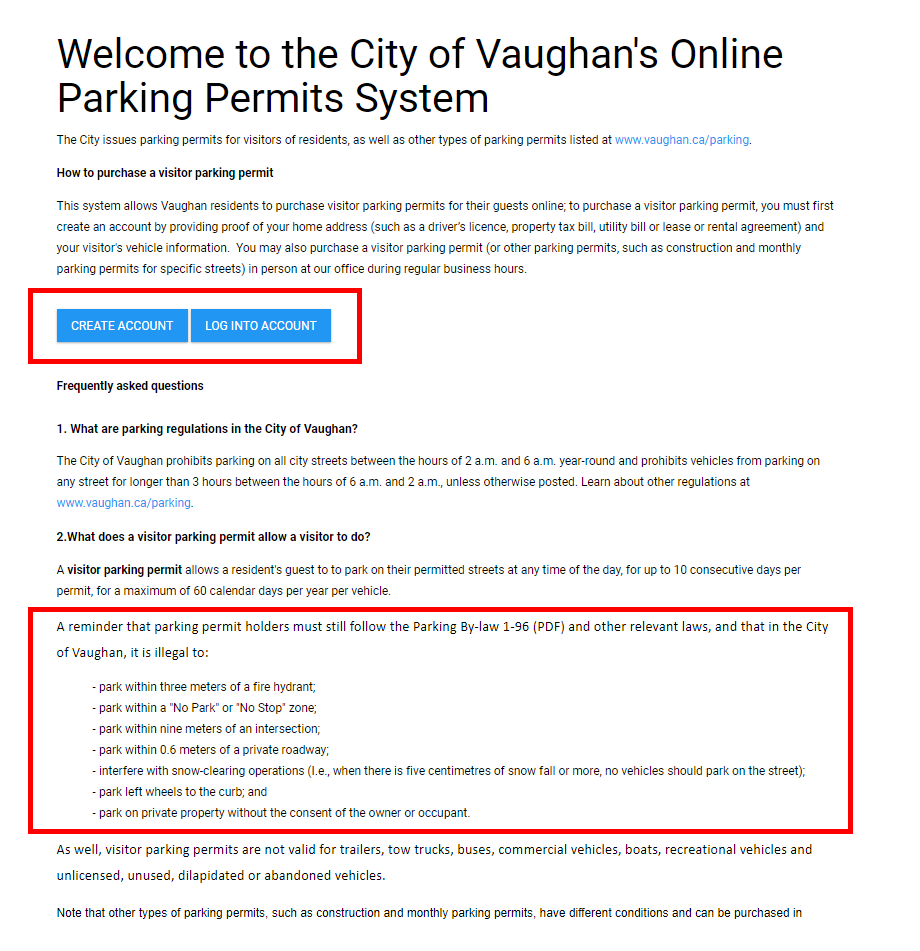
City of Vaughan introduced electronic parking permits to its residents back in 2018. It was a new way to obtain a permit. The system has not been updated since and at that time accessibility and heuristics standards were not taken into account. The process of obtaining a parking permit needs to be simple and user friendly.
Accessibility
The user portal needs to incorporate Accessibility standards to ensure its providing a seamless experience to a wide range of users.
Simplify & Consistency
The process of obtaining a permit needs to be as simple as possible with removing the cognitive overload and present information consistency across the platform so the users are able to relate to it in the real world.
User-friendly
Create an improved experience for the user so they are able to consume the application error-free and enjoy the interaction.
Conducting a heuristic evaluation of the City of Vaughan’s online service portal allowed me to identify usability challenges from a first-time user perspective. My focus was on assessing the overall experience—from the initial interaction with the portal to each step required to obtain a parking permit. By outlining key friction points and inefficiencies, I was able to determine the scope of improvements needed to enhance user interactivity and streamline the process.
Several issues need to be addressed here:
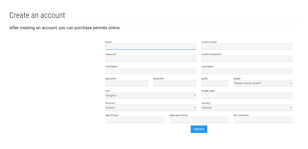
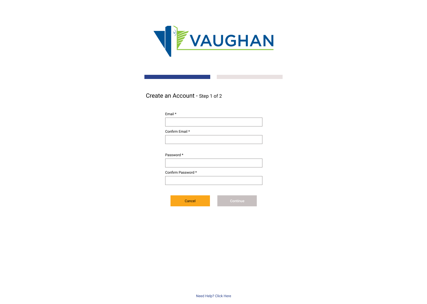
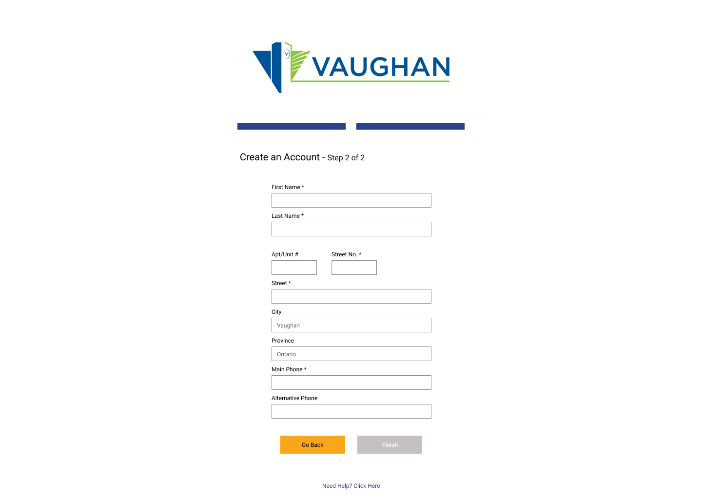
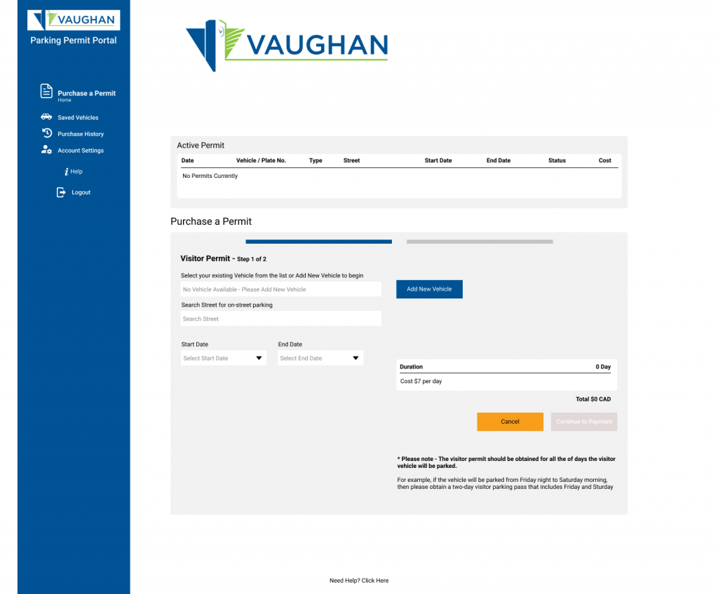
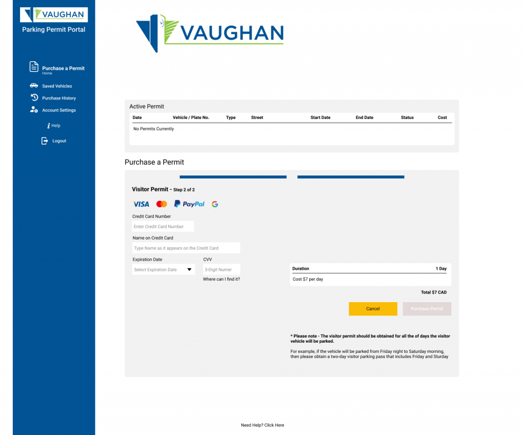
The best practice is to use a single-column form design for improved effectiveness. This approach minimizes cognitive load, allowing users to focus on completing tasks without unnecessary eye movement across the page. Additionally, incorporating a progress bar enhances the user experience by clearly indicating their current step in the registration process, providing clarity and reducing uncertainty.
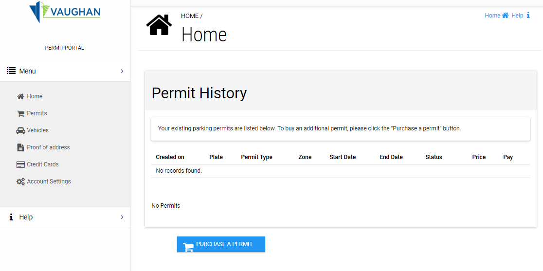
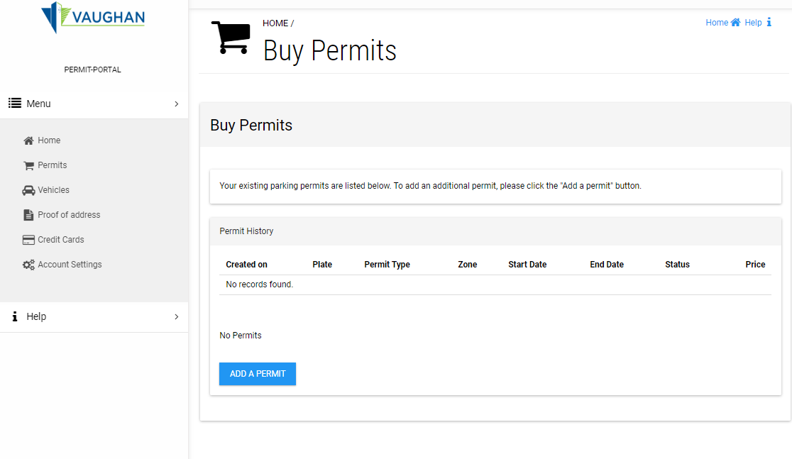
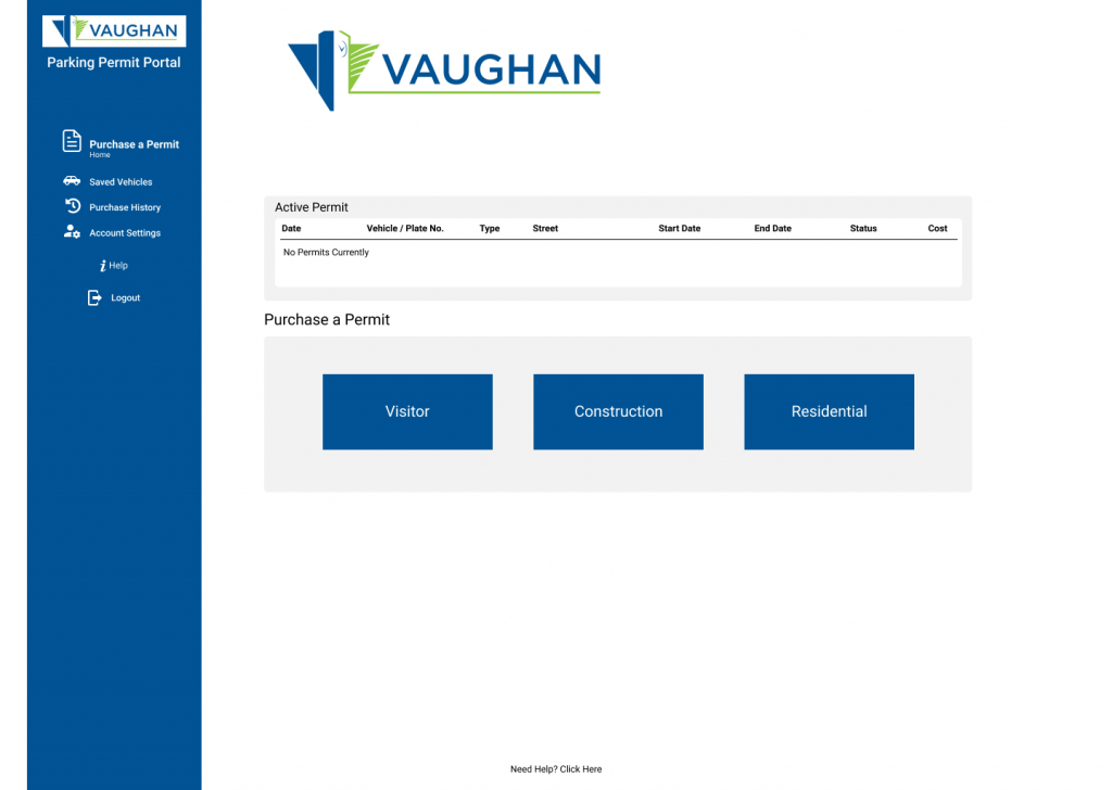
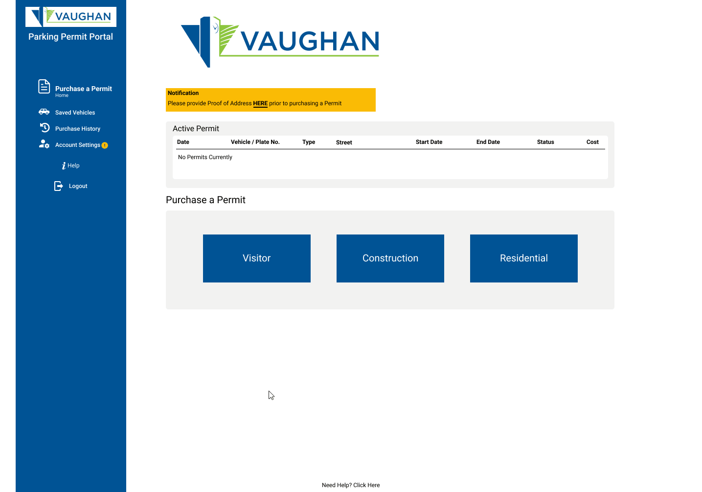
The navigation menu lacks clear indicators, making it easy for users to lose their place within the portal. Additionally, both the Home screen and the Buy Permits screen display the same view, causing further confusion and reducing navigational clarity.
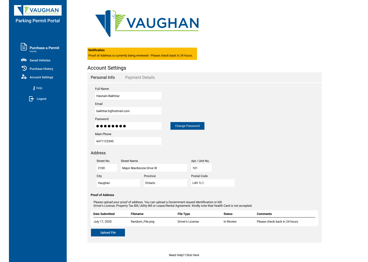
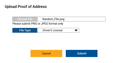
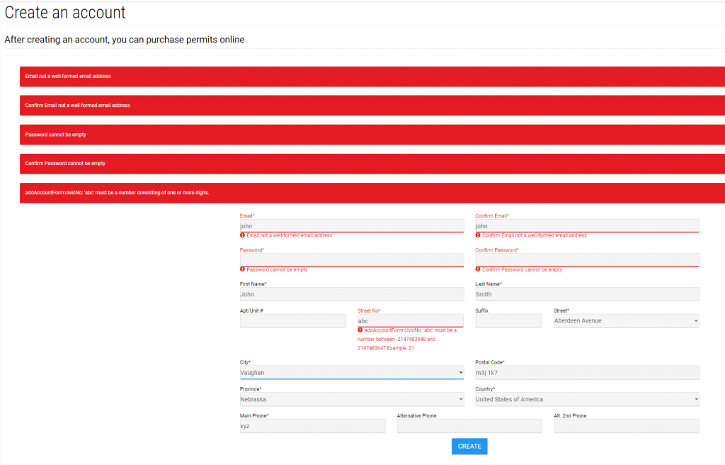
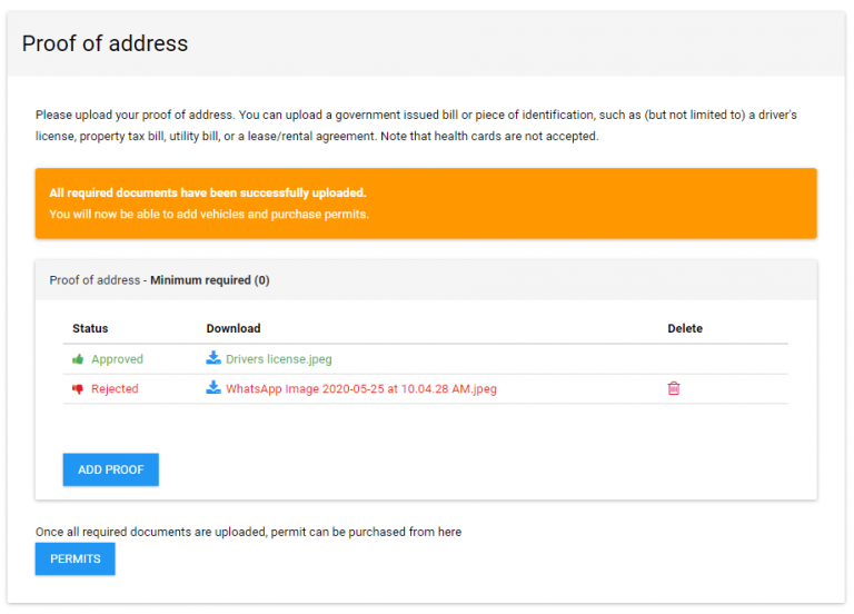
The system lacks clear messaging to inform users why their proof of address was rejected, leaving them uncertain about the issue and how to resolve it. Without specific feedback or guidance, users may struggle to understand whether the rejection was due to an incorrect document type, formatting errors, or missing information, leading to frustration and unnecessary delays in completing their application.
Detailed Error Messages: Instead of a generic rejection notice, display a message specifying the reason, such as:
Inline Error Indicators: Highlight the rejected field with contextual hints so users can quickly identify the issue.
Guidance for Resolution: Provide clear next steps, such as:
Help & Support Option: Offer a tooltip or ‘Need Help?’ link directing users to FAQs or customer support if they need further assistance.