
Pachira is an online Social Enterprise that enable its subscribers to earn discounts & savings through its Retail & Affinity Partners. The funds collected can then be redirected towards charities of the user’s choice – Empowering them to make a global Impact and promoting a culture of a Giving World.
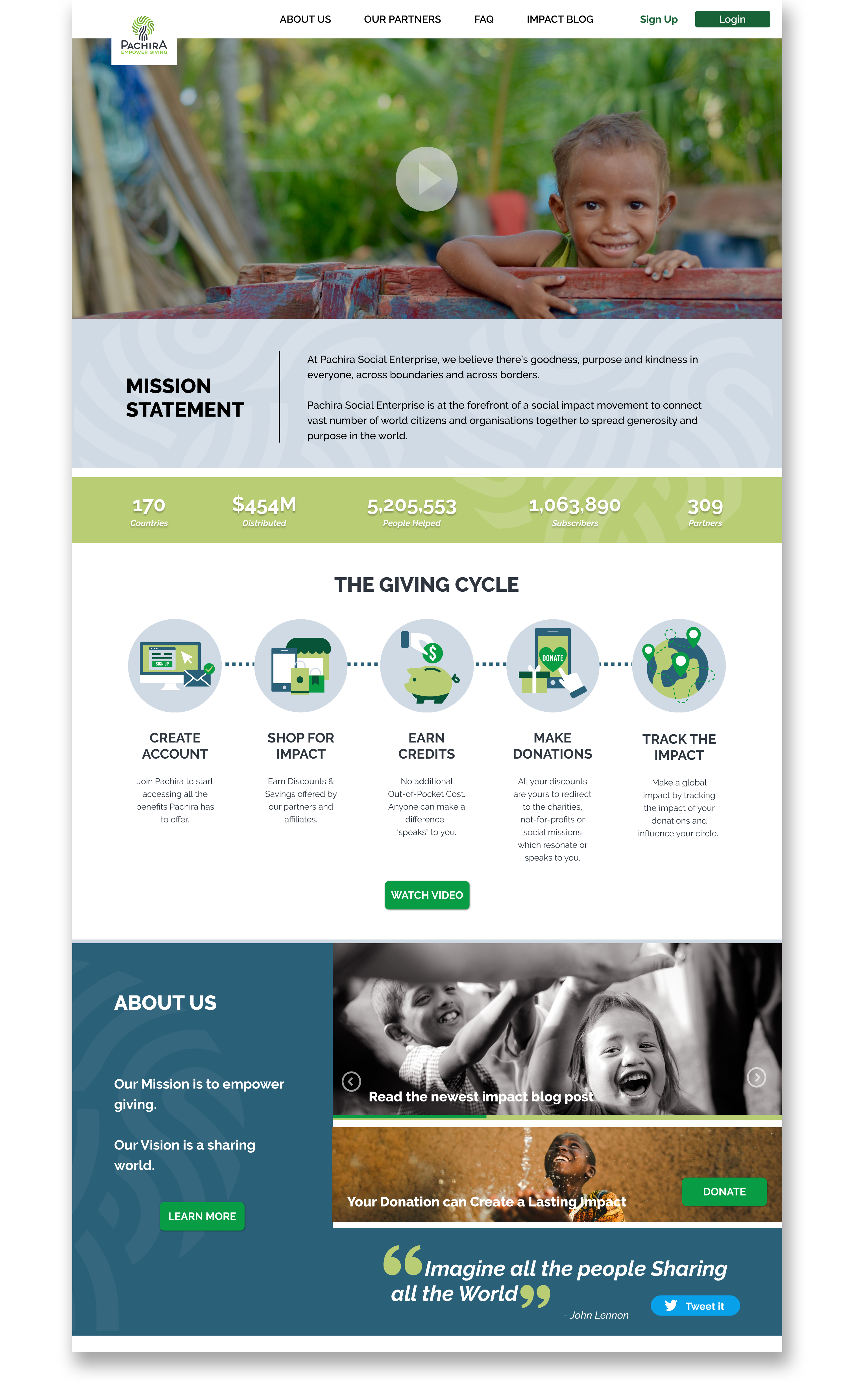


Our mission is to redesign and enhance the user experience of Pachira’s website and dashboard, ensuring an intuitive and seamless platform for users. As an early-stage startup, Pachira aims to attract new users by providing a well-structured, engaging, and user-friendly interface. The redesign focuses on improving content structure, visual appeal, and branding to establish credibility while refining the user flow and interface of the dashboard for effortless navigation. By optimizing these key elements, we aim to create a seamless, functional, and engaging experience that encourages continuous user interaction and platform adoption.
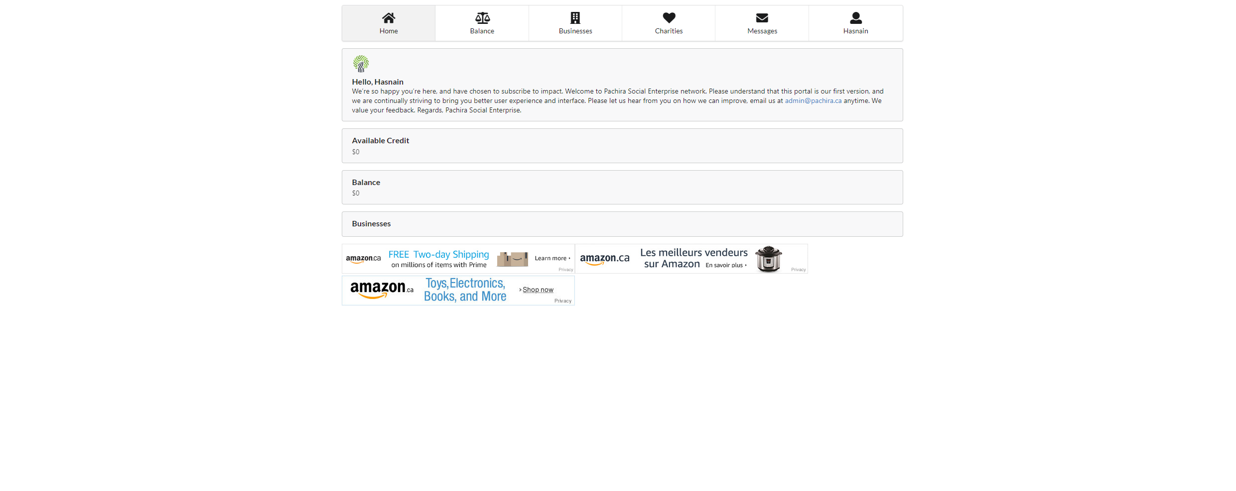
The purpose of the redesign is to help people see Pachira as a reputable organization that enables the users to make an impact globally by contributing to charities that interests them. They need to be able to form an emotional connection and engage with the message. Their unique value proposition is not clearly presented to the users on the website and could be easily lost. On the other hand, the user dashboard comes short of presenting that information to the users when they sign-up. The dashboard has very limited information with a lot of ambiguity leaving the user to sort out on their own.
STARTING WITH HEURISTIC ANALYSIS
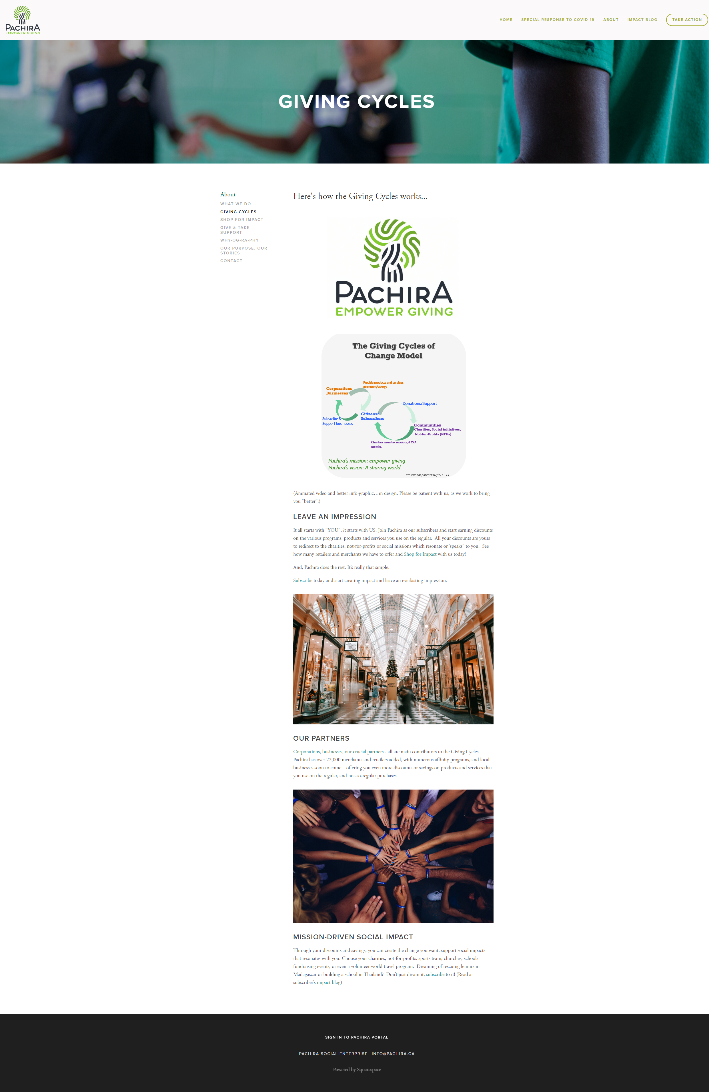
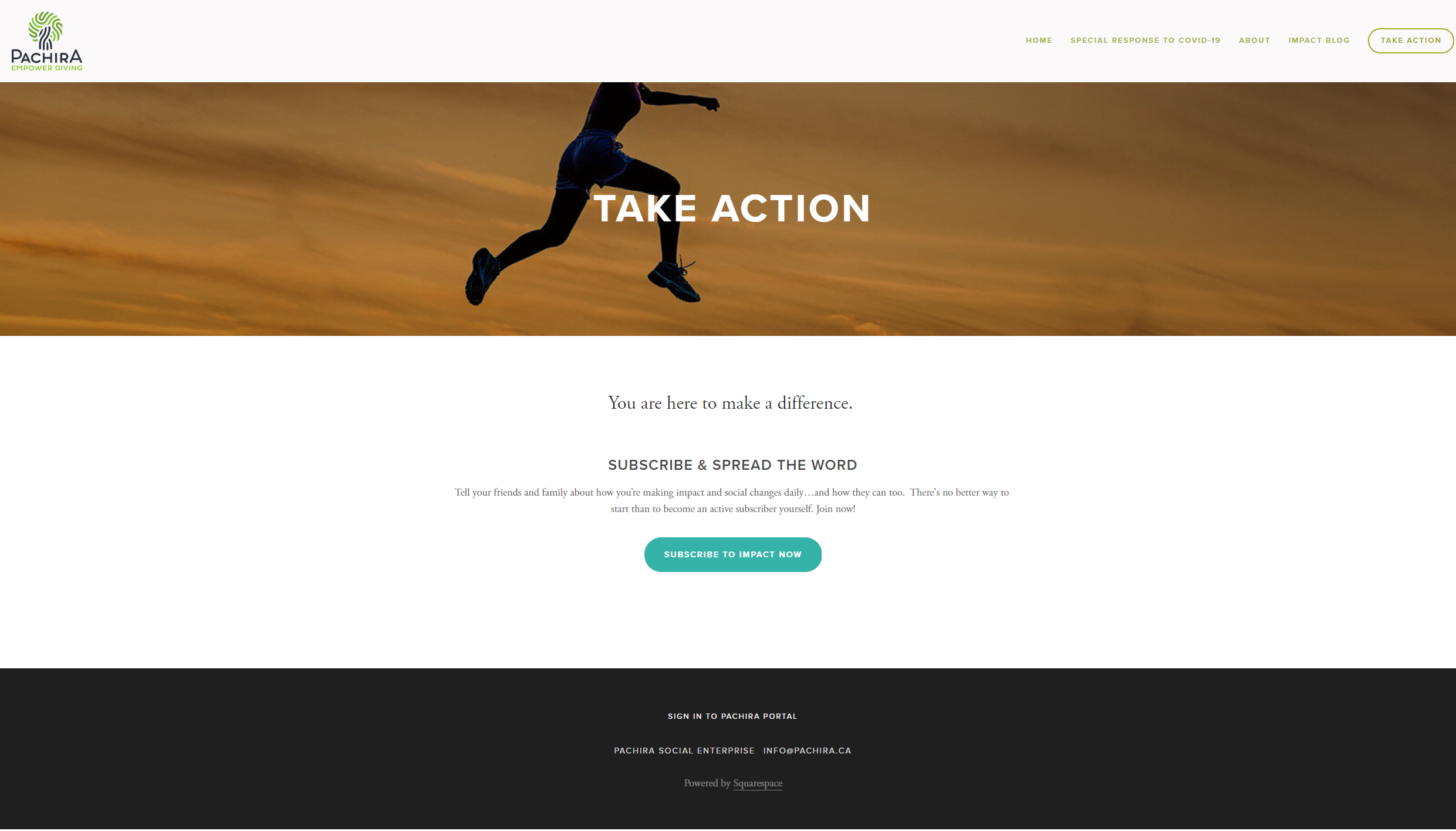
We started with an audit of content and began uncovering usability problems in the user interface design so that we can attend to is as part of our iterative design process. This process was fairly easy to notice as the site required a lot of attention and lacked proper content structure and branding. The landing page needed to create a great first impression and capture the user’s attention visually and emotionally so it motivates them to signup. The user dashboard was not fully functional and had broken task flows that needed to capture a proper user experience.
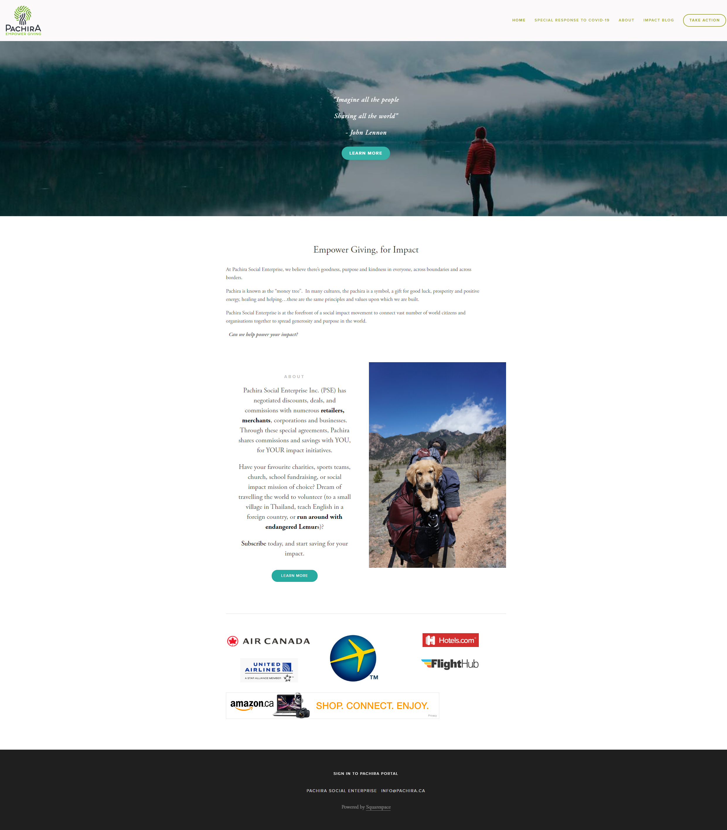
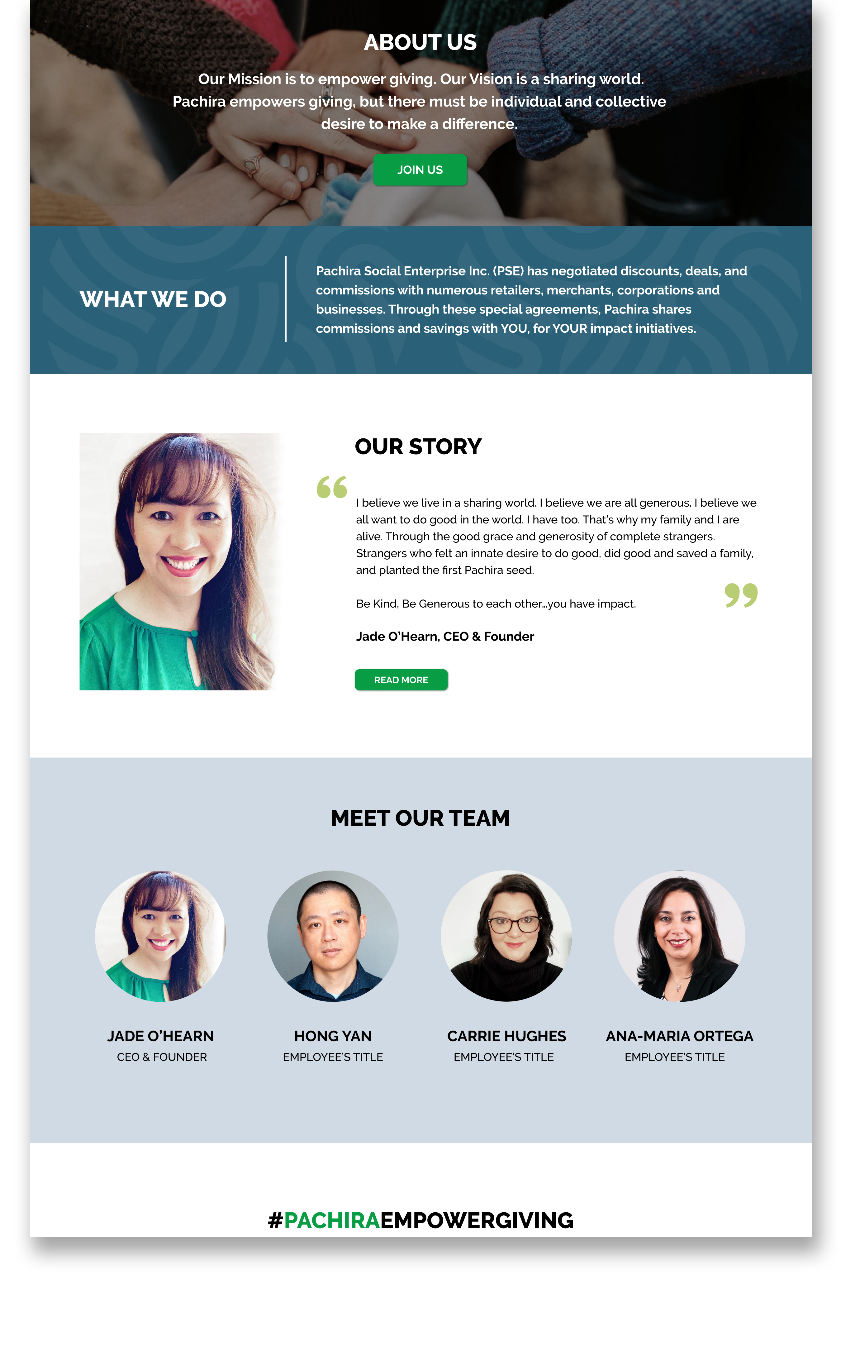
There are a lot of pain points that exist in the website currently. The major issues are prominent in the way the use of white space is utilized, the imagery doesn’t relate with the purpose or objective of the Social Enterprise and overall branding gives an impression of a personal blog more than a business.
The Landing page lacks consistency in the following areas:
Application Improvements
| GETTING TO KNOW THE USERS
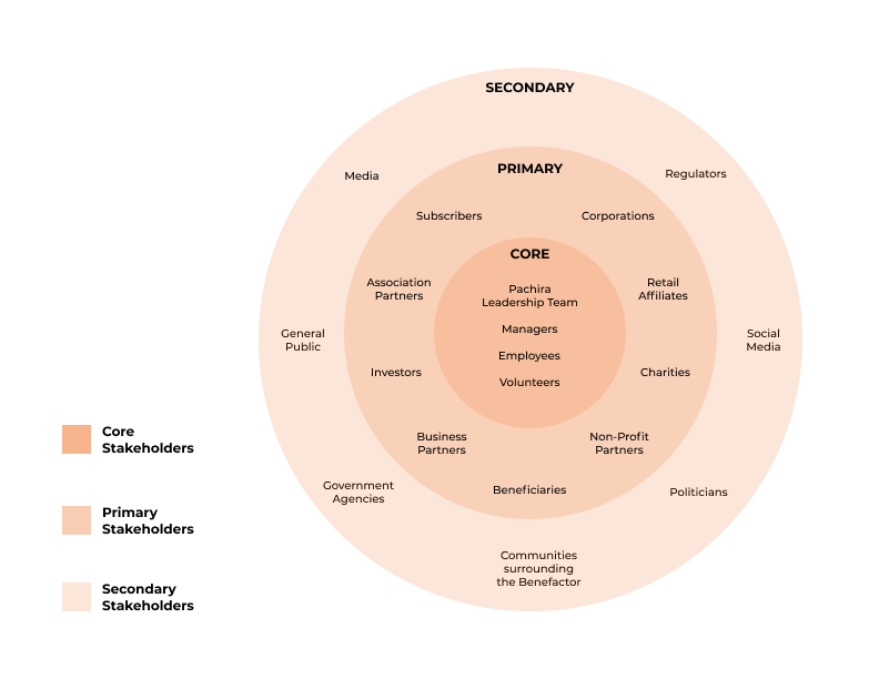
On the other end of the Spectrum, there was a need for us to define our users. This way we know who are the Primary users we are solving our design problem for and understand the way our Core and Secondary users will be impacted and consume the product.
Based on our finding and getting to know the users, our team conducted 8 interviews to learn about user experiences and opinions on online charity organizations.
What does the current landscape of Online Charitable Organizations look like? & What are user perceptions?
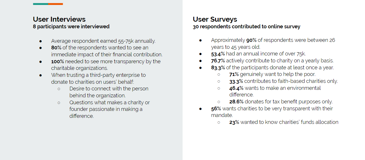
Trust & Transparency is a key driver in getting users to engage in an Online Social Enterprise.
Can see themselves donating through an online Social Enterprise if their personal contribution objectives and functionality criteria about charitable organizations are fulfilled .
A similar business model that closely resembles Pachira is Honey and Rakuten, where the both companies partner with other corporations and businesses to provide users incentives and discounts. However, the similarities end there. Honey and Rakuten negotiates and pass on a percentage of savings to the users whereas Pachira passes the money from the percentage of savings to a charitable organization of the user’s choice.


Charitable Impact consolidates all of the user’s donations in one platform allowing for seamless management. This convenient platform may attract Pachira users who will eventually have the ability to donate more.

Charity Intelligence lists Canadian charities and their financial transparency, results reporting, demonstrated impact, need for funding, and cents to cause. It would be an ideal partnership to help increase Pachira’s transparency and commitment towards their mandate.

Mylo will round up every purchase that users make to the nearest dollar, and users could make donations with their spare change.

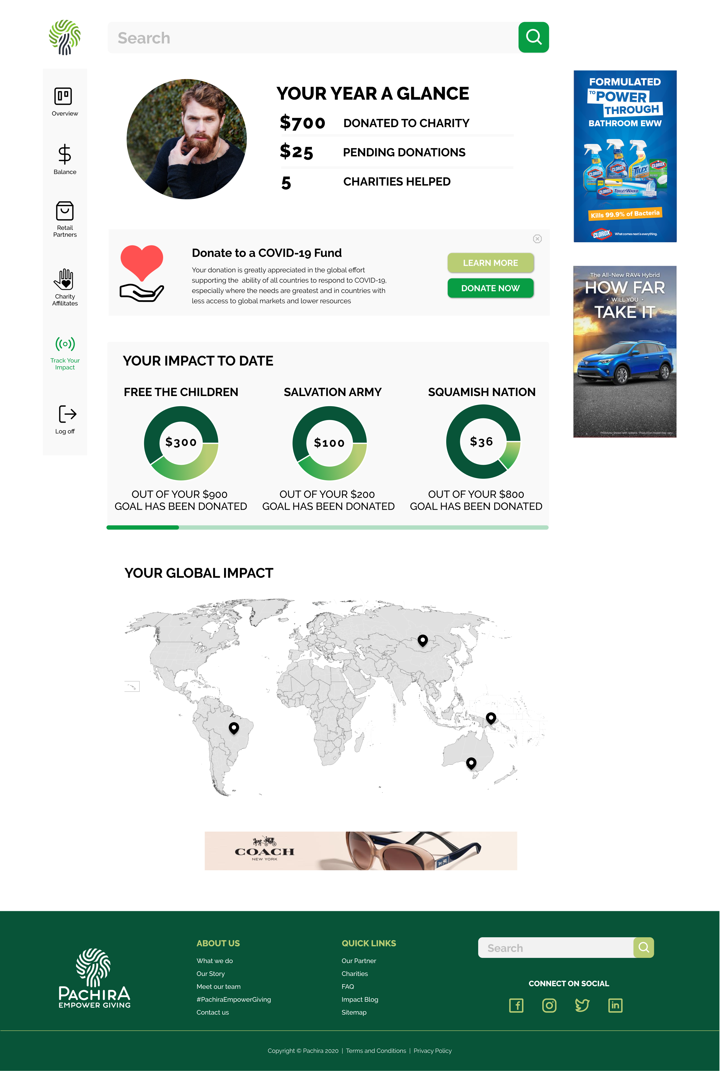
Me to We’s “Track Your Impact” tracks donors’ charitable donation and their impact which increases transparency. By implementing something similar, Pachira can increase transparency and trust; this is crucial especially for a new enterprise.
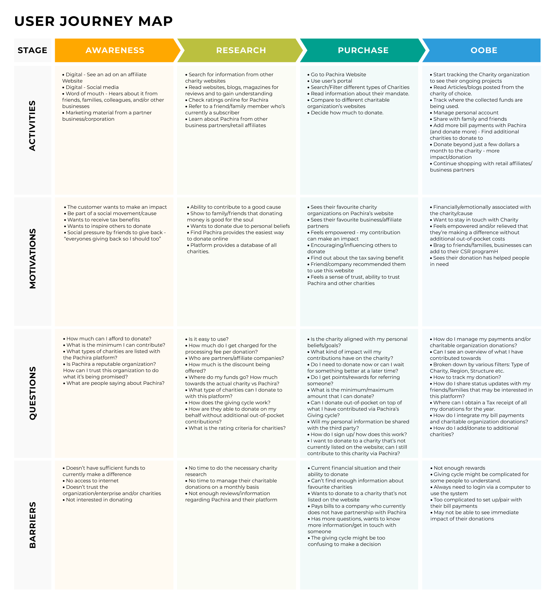
Based on the data collected from our Primary and Secondary Research, we organized our observations and categorized them using Customer Journey map. This allowed us to expose pain points that could potentially create roadblocks for the user with the current website and why.
Business
Users
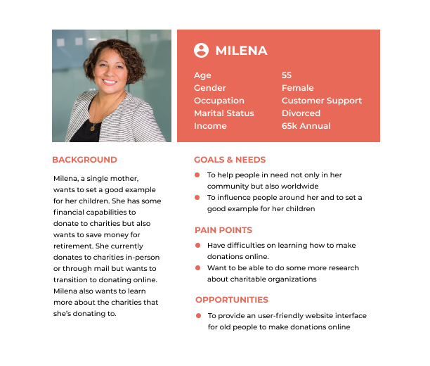
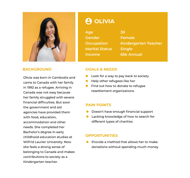
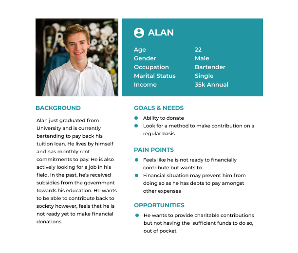
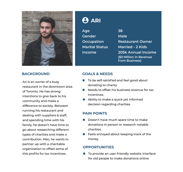
To develop and understand a deep sense of empathy, we developed our personas for our target audience, to guide us in creating exceptional user experience for the final product. It helps us understand the basic question – “Who are we designing for?” and also provide direction for design decisions in terms of the audience, their mental models, behaviours and so forth.
For Pachira’s users we narrowed down to Four basic Personas, with a very broad age range early 20’s to well over 55 years.
In this activity, we tried to generate ideas while everyone remains quiet. This allowed us to generate as many ideas as possible without being influenced or distracted by other members.
The goal amongst us was to write individuals ideas quickly on a sticky note based on feelings and thoughts. We took 3-minutes to cover this activity. The outcome from the session prepared us for the next step in developing our wireframes. Our focus was on elements that will derive value for the users and continually attract them to come back to the portal.
As we progressed, some elements were taken out by process of elimination and helped us understand the content hierarchy better and user flows should look like.
We created several different concepts for each page that were needed to be improved. We began by picking elements from each concept that we liked and felt would meet the client’s requirement and user needs better. Once we had a complete list of them, we narrowed down and filtered out the ones that fell short in providing a seamless user experience.
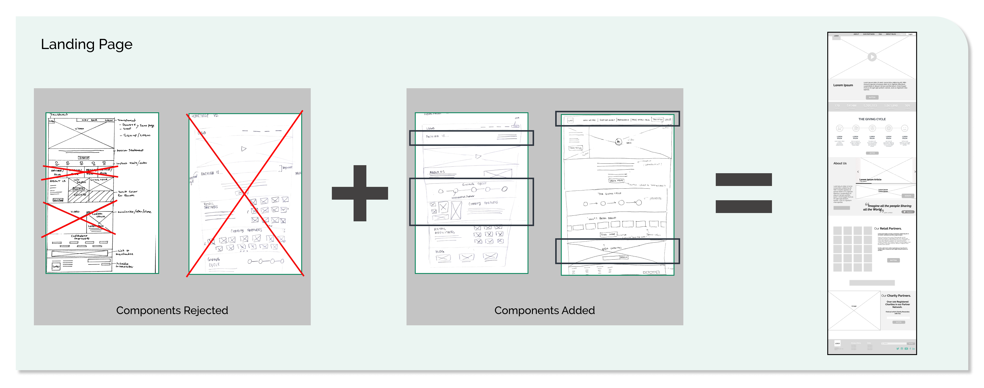
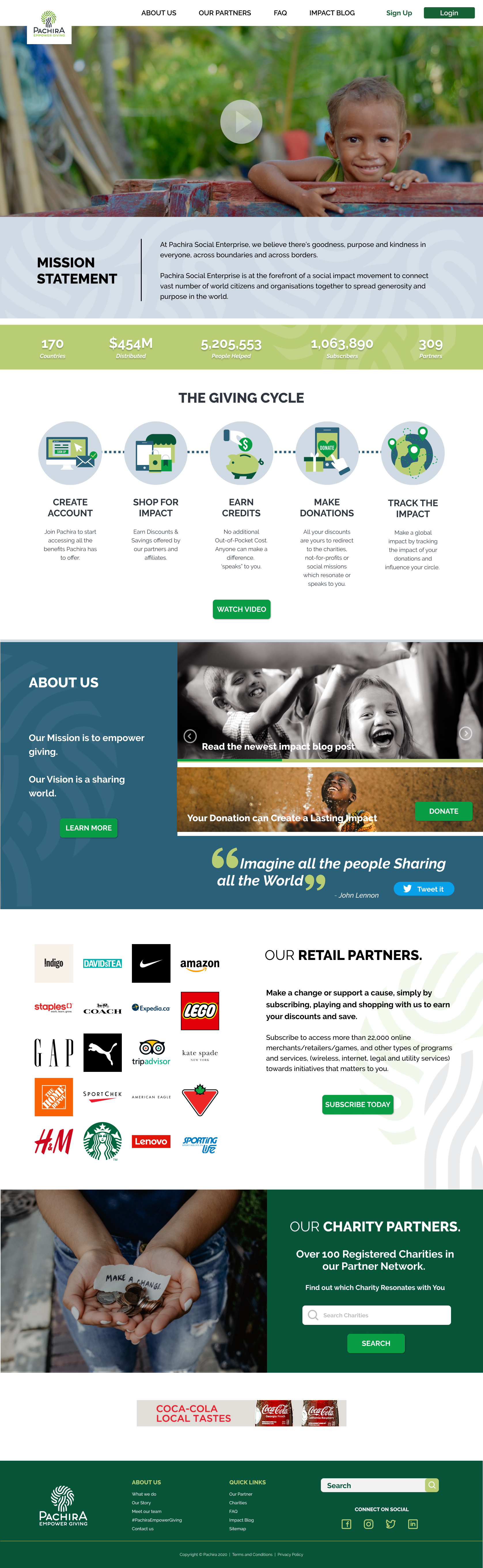
We started sketching out potential options for the Landing page. I looked at other organizations’ pages to draw inspiration on what worked well. I personally liked the idea of a modular design for the landing page as it can potentially give the user all the first-hand information they might need and can allow customization based on the client’s need in the future. But looking back at the initial sketch, it felt very busy and we needed to balance out some of the containers. The low-fidelity wireframe was well laid out with proper use of the white space.
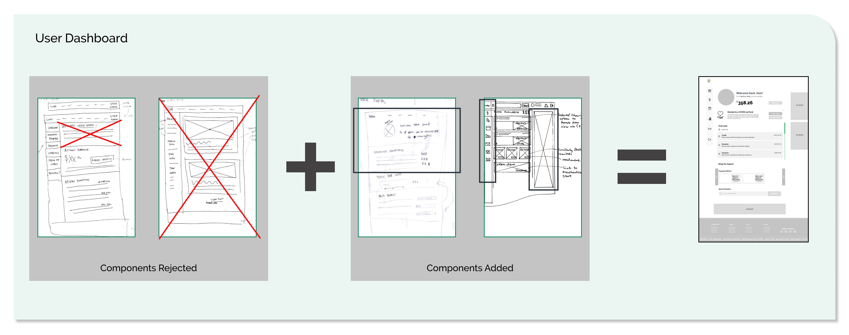
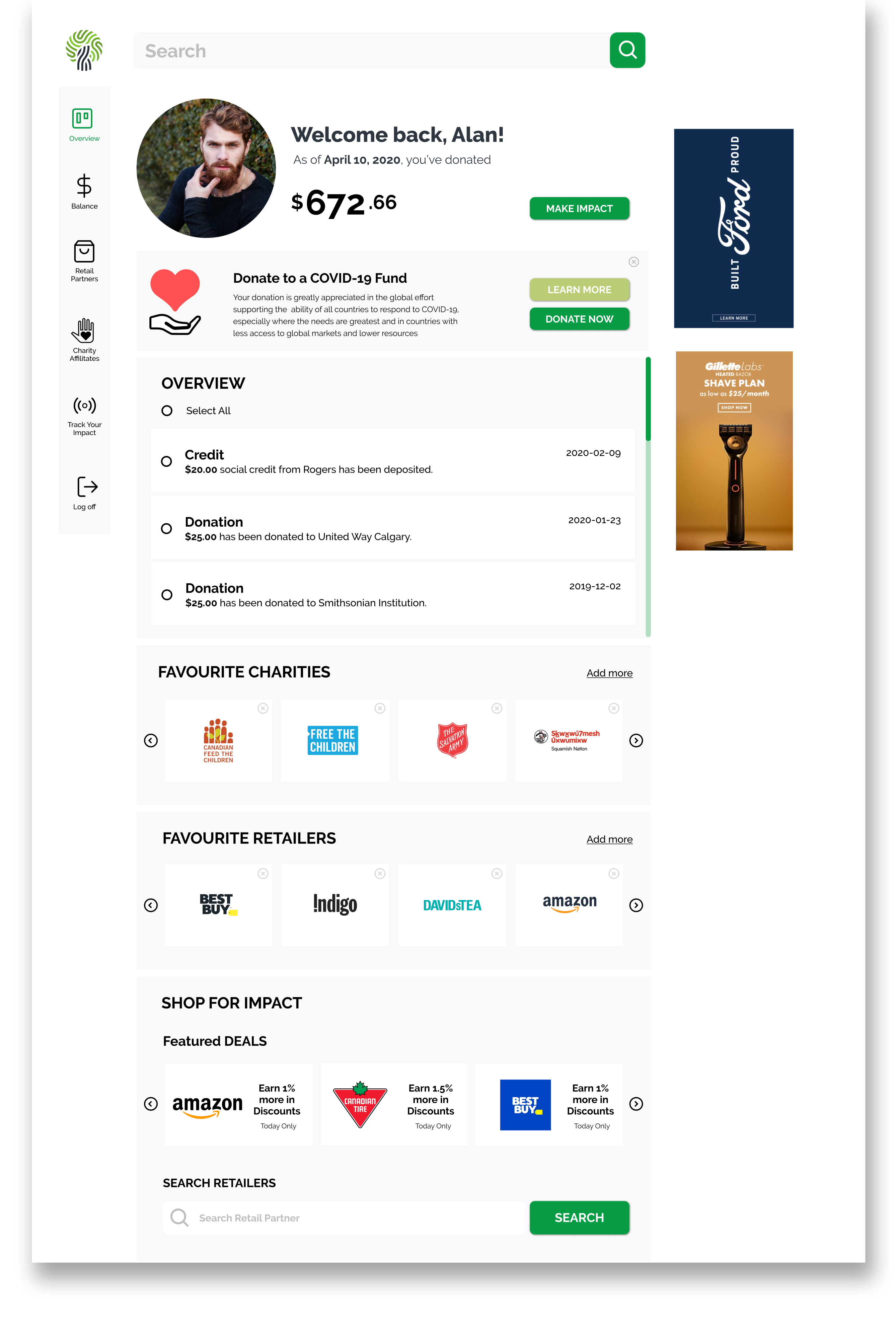
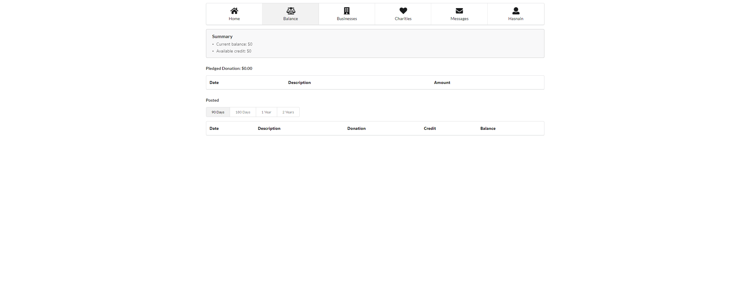
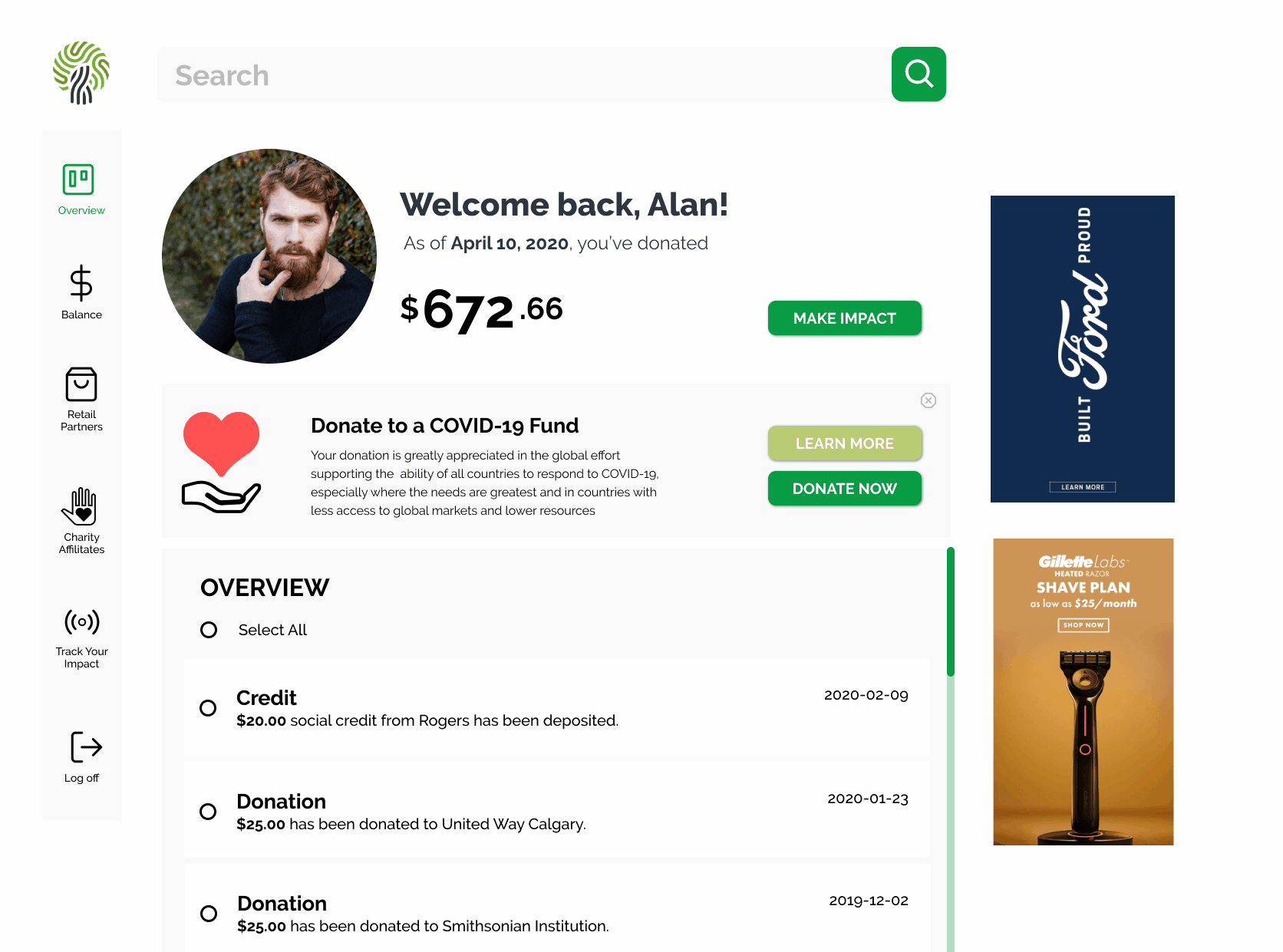
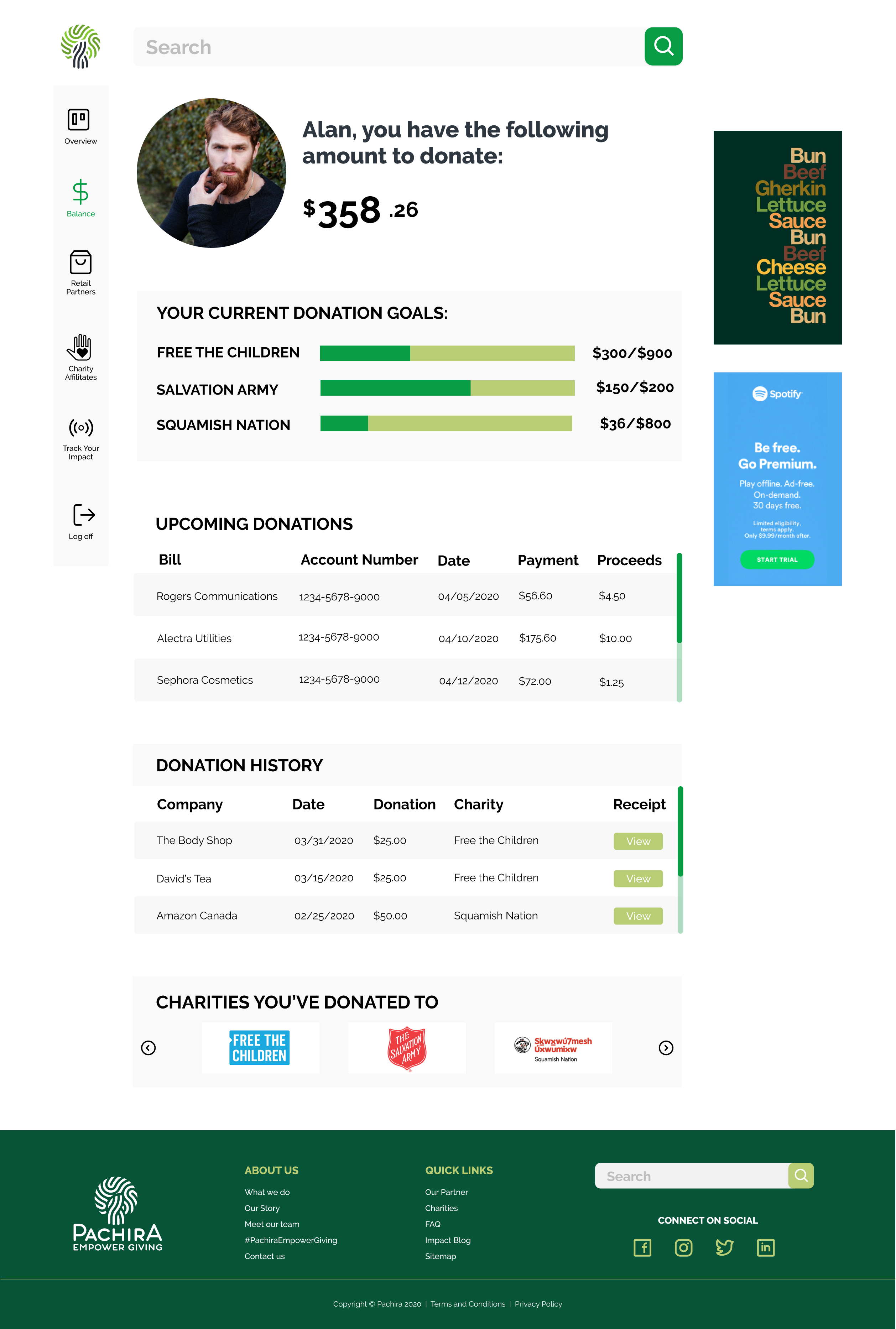
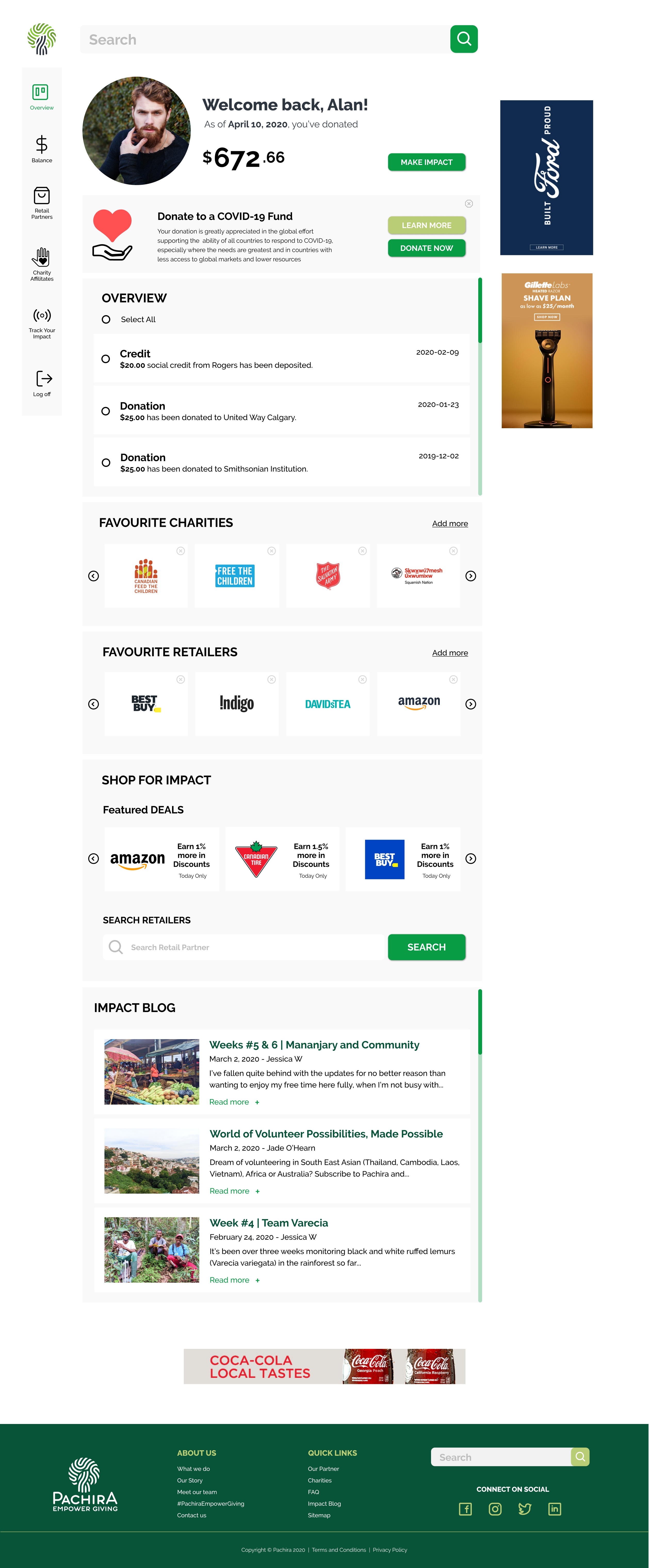
As for the User Dashboard, we opted for the side menu as opposed to setting up on top of the page. We felt that there is a possibility that some users will utilize their mobile to view the platform, which is in the works as a future project to develop a mobile app. But for time being, it will be practical to allow a seamless experience on both surfaces. Sidebar menu seems the right choice for easy navigation.
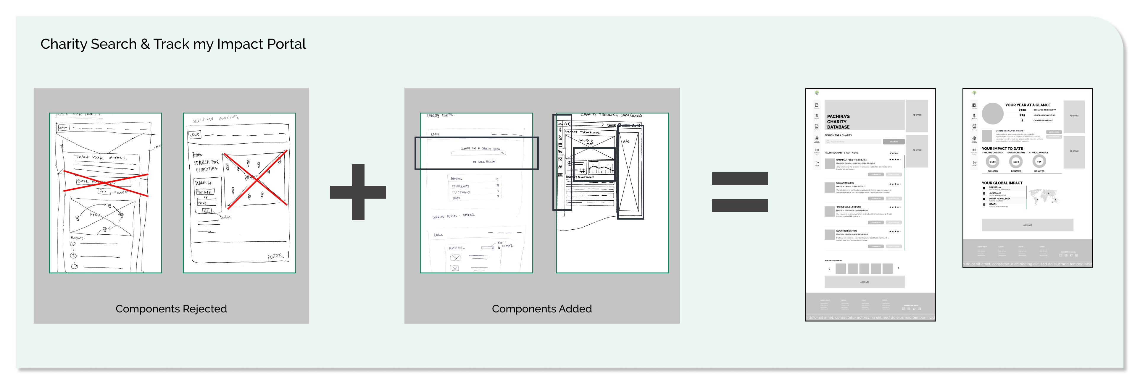
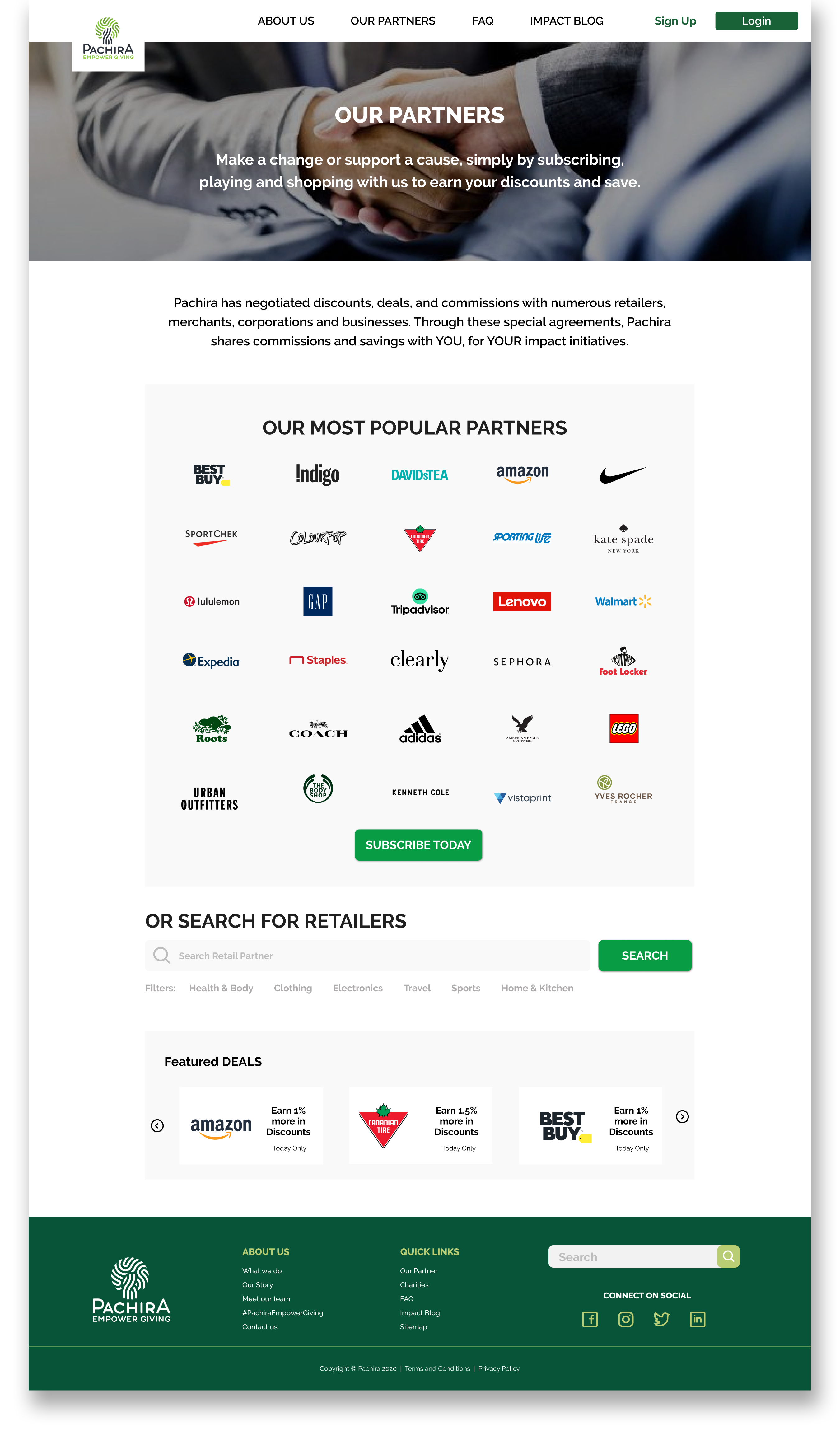
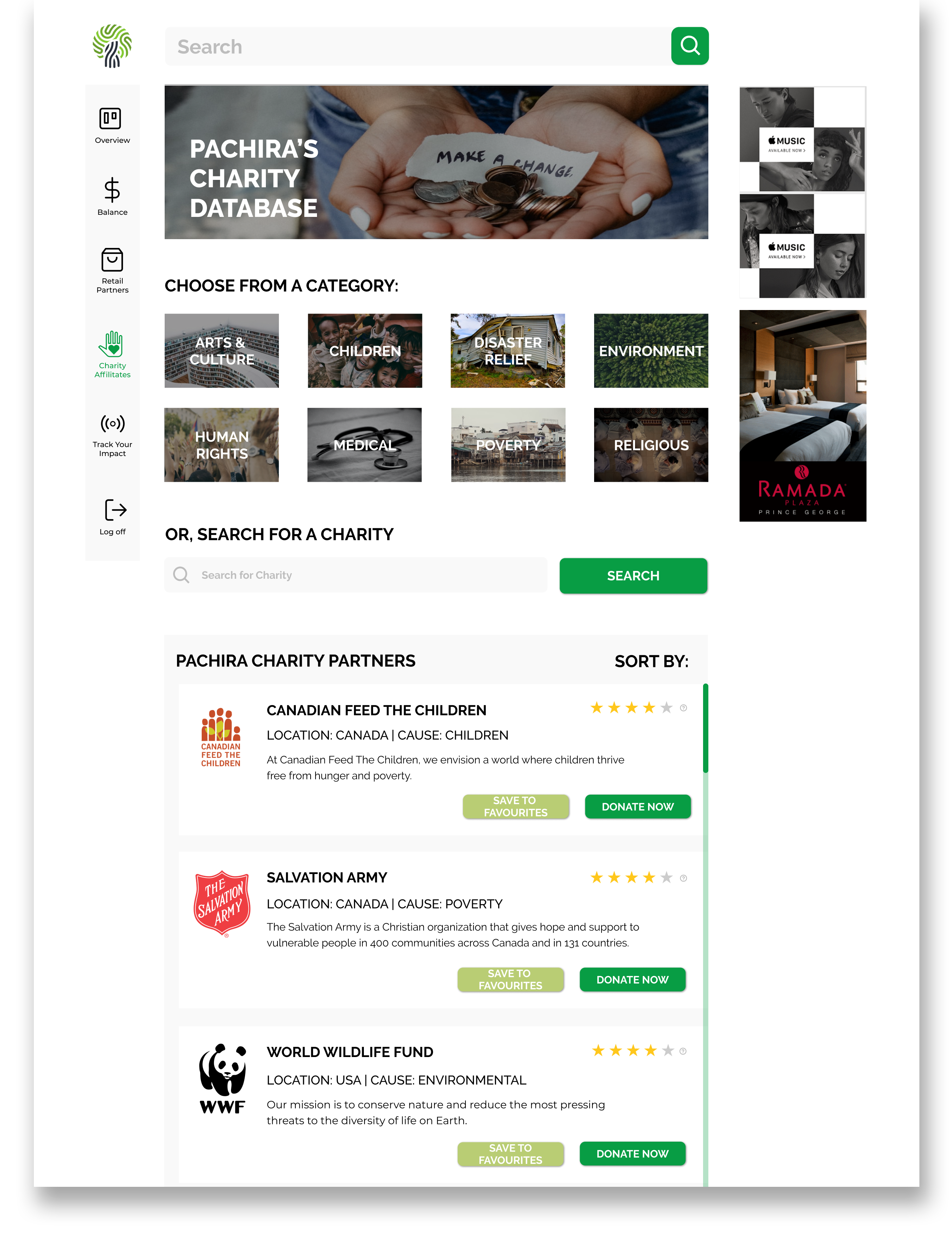
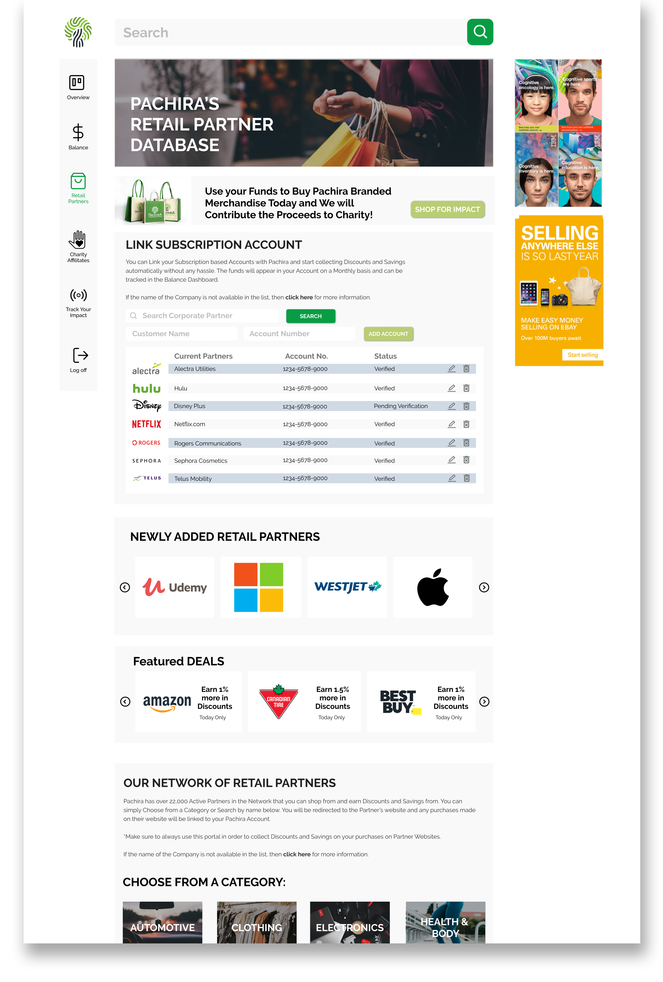
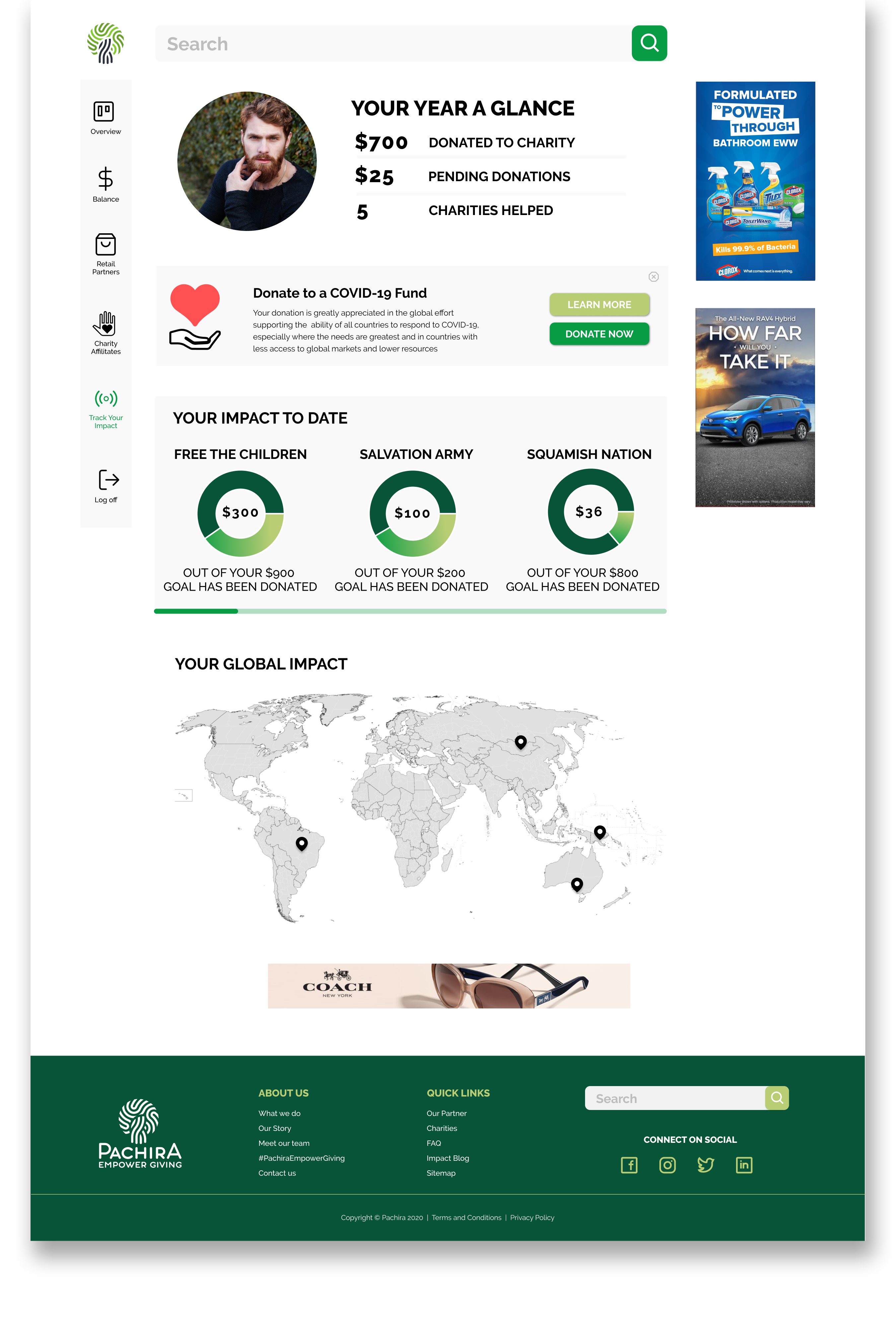
We went through rounds of sketching before we felt comfortable with the look and information what needed to incorporate on the Charity Search and Track my Impact Portal. From our research and also based on client’s feedback, we knew that including a graph/chart view is going to be an important element for the users to be able to see how well their funds have made a global impact. So this element was captured on all of our designs but very differently. So getting this right took some time – with what you see in the low-fidelity wireframe. And same goes for the Charity Search Feature. Especially because it is part of Pachira’s value proposition – allowing users to look up various charities in the network with different search functions/filters.
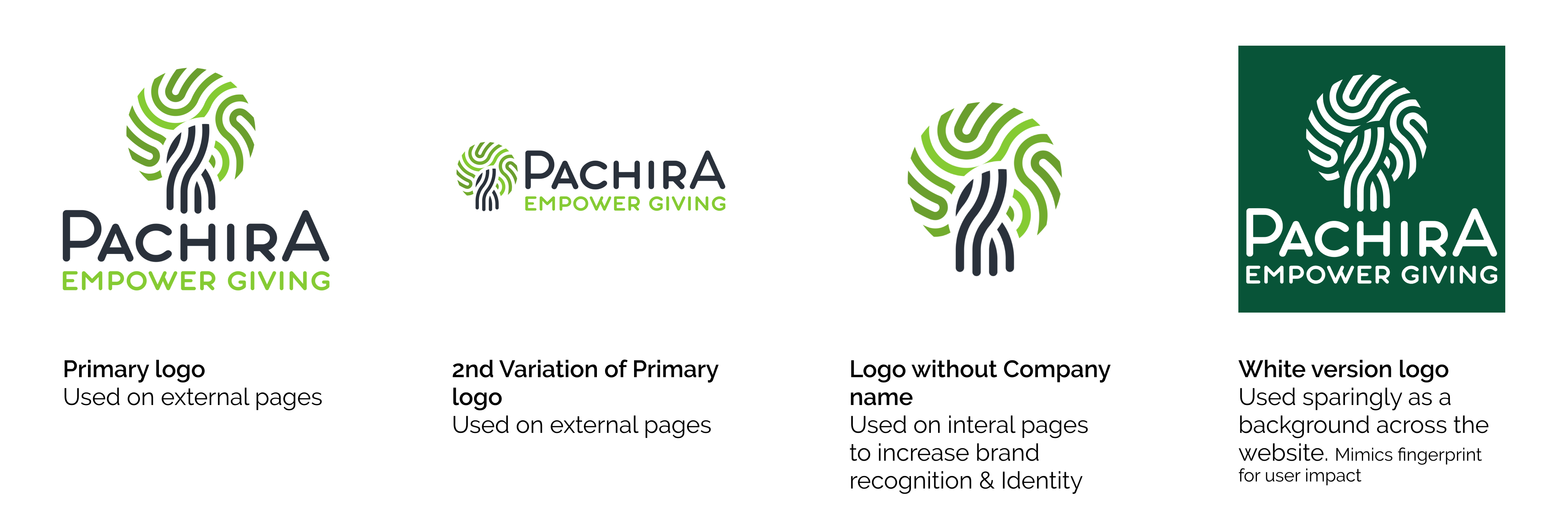

In terms of the colors selection, we wanted to stick with the green that existed in Pachira’s official logo. There is a variation of green that can be found in the logo – from light to dark. To add some depth to the colors and the bring them out, we selected Chinchilla light Blue and Calypso dark Blue. These colors will act as accent and compliment the green on the website and dashboard.

One of the things that is currently missing from the existing user dashboard is the use of icons. We wanted to implement a proper consistent feel overall. This included icons, buttons, form elements and infographic.
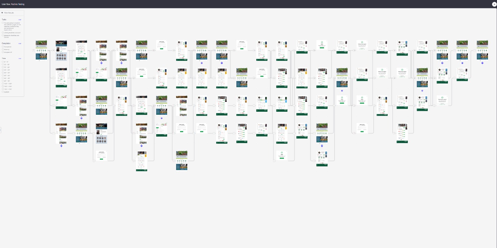
For Usability Testing, we picked out 3 separate tasks that we were interested in seeing how users fare.
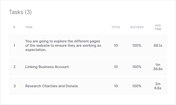
1st Task – was to test how well the users are able to move around and navigate on the website. We provided them with a few Topic/headline to locate on the page. For example, on the Landing page – learn about the Mission Statement and about the Giving Cycle.
2nd Task – we wanted to see how easy users are able to login and pick a dashboard functionality on the Retail page and link a Subscription-based account with Pachira.
3rd Task – was a multi-step process where the user was expected to login to Pachira’s portal and search a charity called “Feed the Children”, once located then save to Favourite and finally donate $25 dollars to the charity and logout.
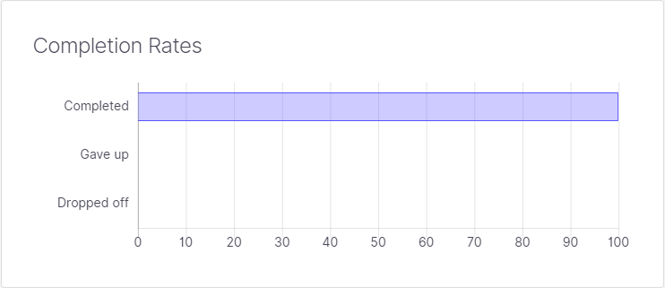
Based on the above three tasks, the users were able to follow instructions and fulfill each completely till the end without giving up or dropping off – 100% completion score was a good indication of what we had hoped to achieved.
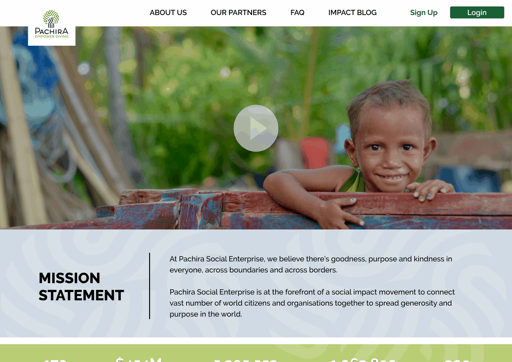
We wanted to create a simplified Sign Up and Login for Pachira, to maximize the experience for its subscribers. The current state was very cumbersome and located at the very bottom of the page in the footer – was not an easy find. We decided to make a very simple yet effective process with low-effort. The button is now located at the top right-hand corner and cannot be missed.
With our new dashboard, the users will have the ability to search charities by various filters and add their preferred charity to their Favourites. This will allow them to seamlessly donate without a need to visit the charity’s profile page each time. A pop-up will appear confirming that the user’s fund has been donated to the charity.
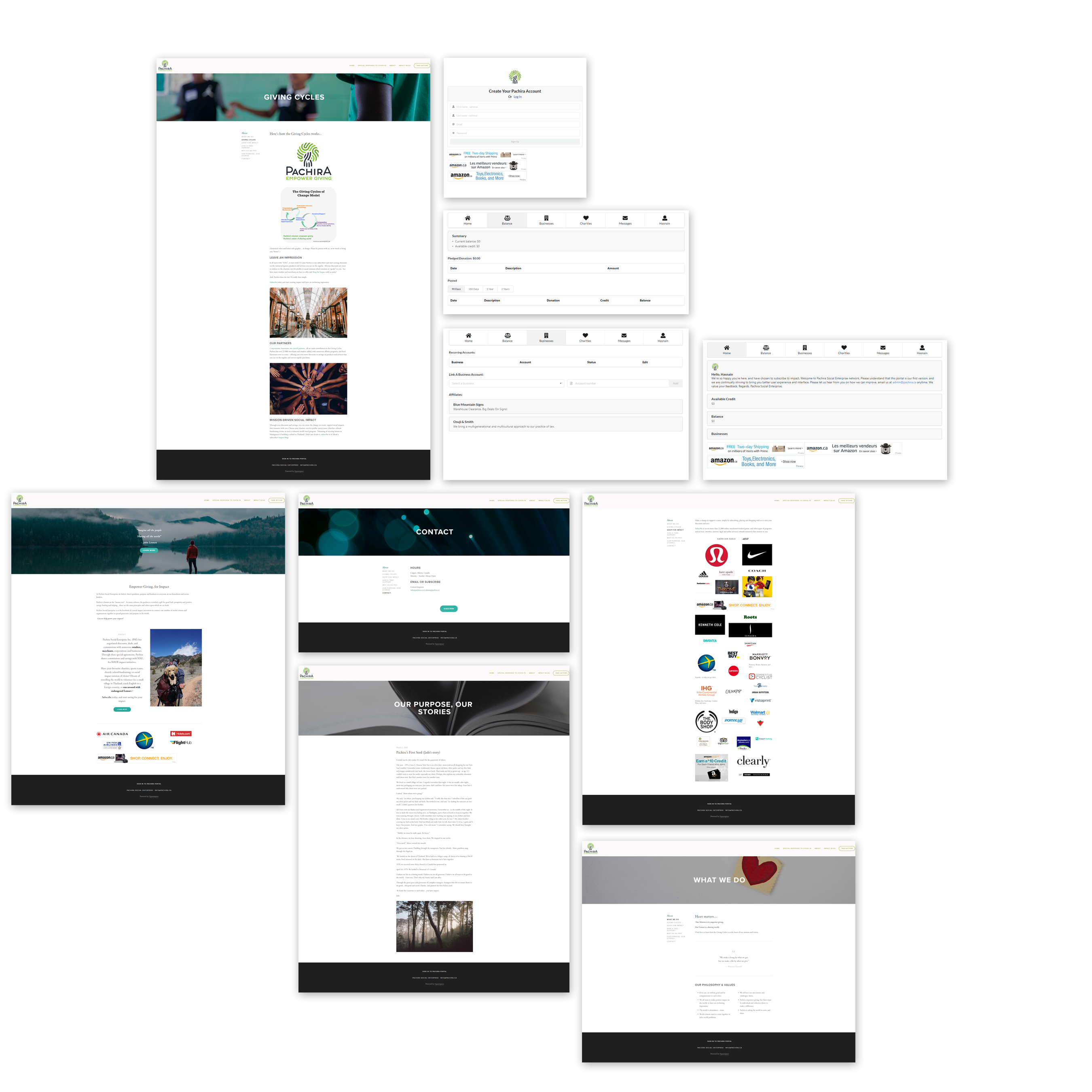
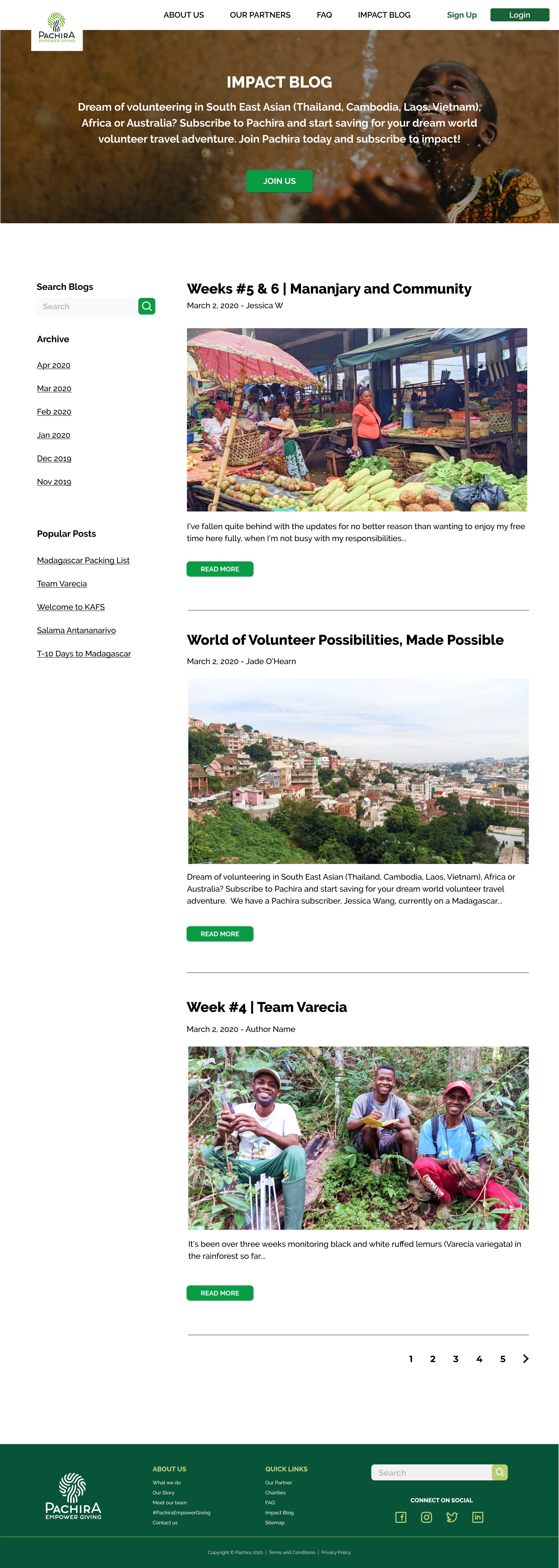
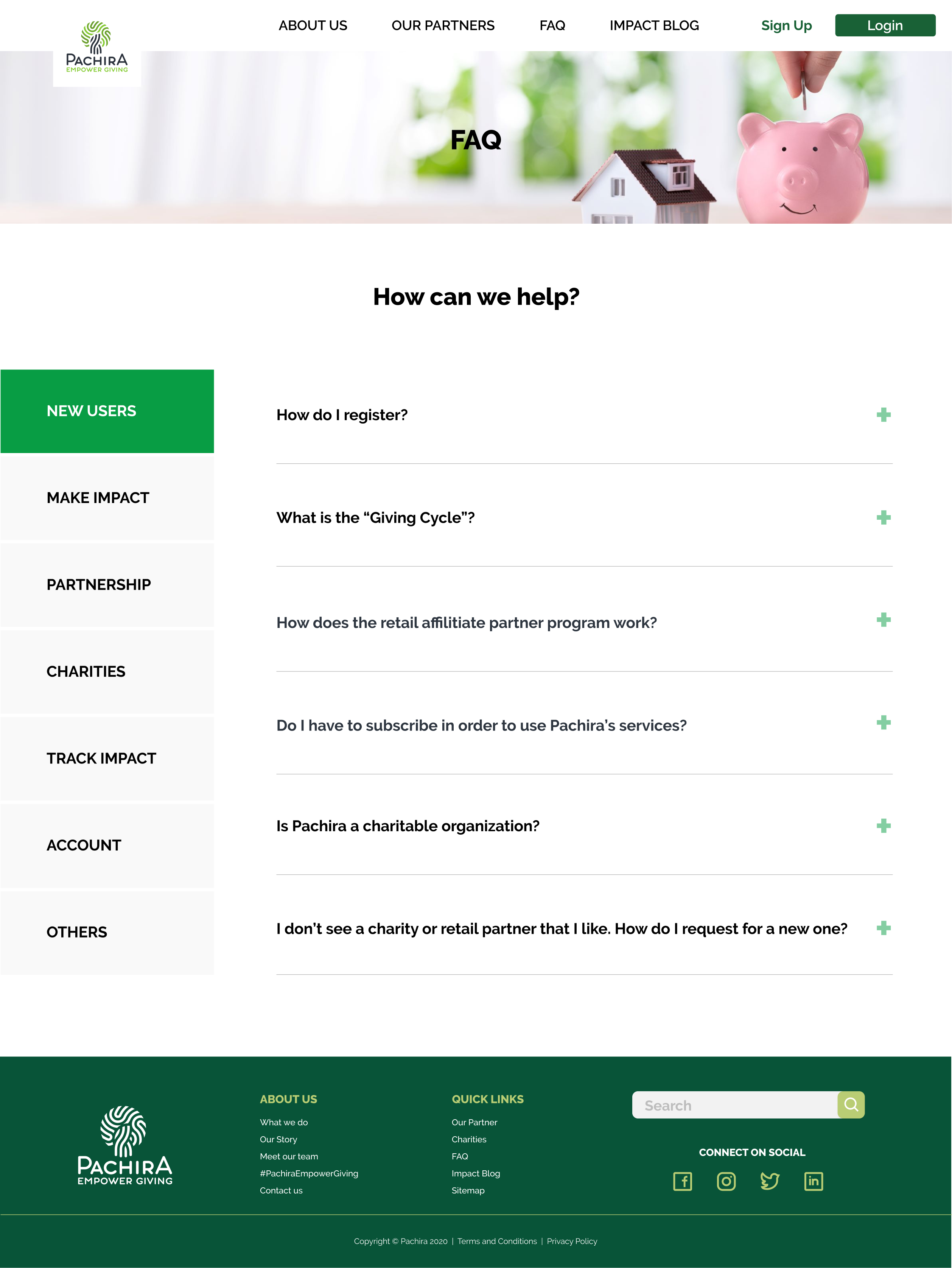
Below are the pages that we developed for the client. It includes pages that will replace their existing website and will be incorporated in their user dashboard. These are the final designs.
Some of the feedback we’ve received is that the new layout feels very responsive and organized. The color schemes used represent the brand really well and looks user-friendly.
Pachira was a very unique project because its a start-up with a very complex business model. There are a lot of moving parts in it. Not only that but we also had to overcome intangible items and make sense out of ambiguity. We were able to convert them to actionable items by coming up with a proper game plan and asking the right questions. Overall project was a success despite the fact that everyone was impacted by COVID-19, and we had to take the entire project virtual. We had an interesting team dynamic and each person brought in their unique strengths to ensure that we were able to apply our research and ideation methodologies to it and it was delivered on time. A way we were able to overcome challenges is by keeping an open-door policy on raising issues and collaborate on various ideas till we know it will work and can be validated by testing.